

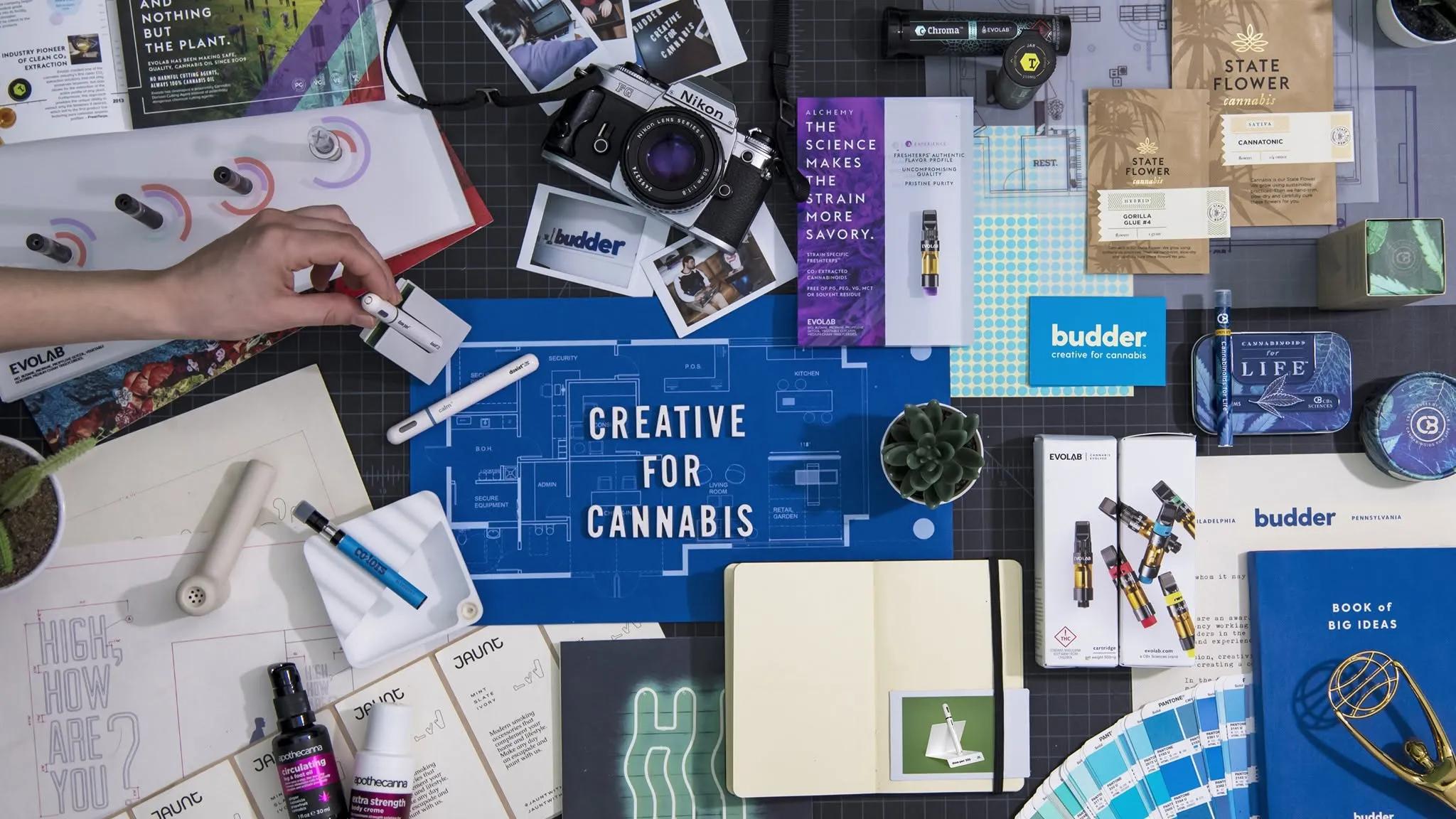
A cannabis brand can start with a pretty simple idea. Maybe it is a new product, a different audience, or just a founder who thinks the market looks way too similar. Turning that thought into something people can pick up, understand, and trust is another thing altogether. This is where cannabis design starts doing real work. It is not just about making a logo look good or choosing a trendy colour. A creative agency has to figure out what the brand is saying, who it is saying it to, and how that message survives when the product is sitting beside twenty other products on a shelf. Sounds obvious, but plenty of brands miss this part.
Finding the Brand Before Designing It
Good creative work usually starts before anyone opens a design program. The agency needs to understand the product, the audience, the category, and what makes the company different without forcing some fake story onto it. A premium edible should not look like a budget product, and a wellness-focused brand probably needs a different visual language from something built around nightlife and culture. These decisions shape everything that comes later. Typography, imagery, colour, packaging materials, tone of voice, even the tiny details people might not notice straight away. It all needs to feel like it belongs to the same brand.
Building a Visual Identity That Has Some Backbone
Once the direction is clear, the visual identity starts taking shape. This normally includes the logo, type choices, colour system, graphic elements and the overall look that carries across different products. The important thing is consistency, but not boring consistency. A brand needs enough structure that people can recognise it quickly, while still leaving room for new product launches later. That balance is harder than it sounds. If every product looks completely different, the company starts feeling scattered. If everything looks identical, customers may struggle to tell one product from another.
Designing for the Shelf, Not Just the Screen
A design can look brilliant on a laptop and fall apart completely in the real world. Packaging gets viewed from a distance, under bad store lighting, beside competing products, and sometimes while someone is in a hurry. So agencies have to think beyond the nice presentation mockup. Where does the product name sit? Can the important information be understood quickly? Does the front panel still work when reduced in size? Is the hierarchy clear? These practical questions matter because shelf presence is partly about aesthetics, but it is also about recognition and speed. Nobody studies every package for five minutes.
Making Packaging Part of the Brand Story
Packaging is often the first physical interaction someone has with a cannabis product. That gives it a bigger job than simply holding the product. The material, finish, structure and graphics can all communicate something about the brand. Minimal packaging can suggest a different kind of positioning than loud, heavily illustrated packaging. Texture can change how a product feels in the hand. Even small choices, like a matte finish or a particular label treatment, can make the experience feel more considered. The trick is knowing when to stop. Adding more design does not automatically make packaging better.
Turning Creative Concepts Into Practical Artwork
There is a gap between a creative concept and artwork that can actually be manufactured. A professional agency has to deal with dielines, dimensions, print limitations, colour accuracy, typography, legal requirements and all those unglamorous details that suddenly become very important. A beautiful concept that cannot be printed properly is not much use. This stage is where the design gets tested, adjusted and prepared for production. Sometimes the smallest change makes the difference, especially when a package has limited space and a lot of required information competing for attention.
Working With Production Partners Without Losing the Idea
Getting from approved artwork to finished packaging also means working closely with production teams. This is where choosing the right cannabis packaging supplier can make the process much smoother. The creative team needs to understand what materials and finishes are realistic, while the supplier needs artwork that is technically sound. When those conversations happen early, problems tend to get caught before thousands of units are produced. Nobody wants to discover a sizing issue after everything has already gone to print. A good working relationship keeps the original creative idea intact without ignoring what manufacturing can actually handle.
Keeping Compliance in the Design Process
Cannabis packaging comes with rules, and those rules cannot be treated like an annoying final checkbox. Required warnings, product information, symbols, sizing requirements and other regulations can affect the actual layout. That means compliance needs to be considered while the design is being built, not after everything looks finished. An experienced creative team knows how to make required information fit into the hierarchy without making the entire package feel like a government form. There are limitations, sure. But smart design works inside limitations instead of pretending they are not there.
Creating a System That Can Grow
A shelf-ready brand should not only work for one product. Ideally, it creates a system that can expand as the company grows. New flavours, strains, formats or product categories should feel connected to the original identity while still being easy to distinguish. This is where a strong design system pays off. Instead of starting from zero every time, the brand has rules and visual tools that can be adapted. It saves time, but more importantly, it builds familiarity. Customers begin recognising the brand before they even read the name.
Testing What Looks Good in the Real World
There is a point where you have to stop staring at the screen and look at the actual thing. Mockups help, but physical samples reveal problems that digital files hide. Colours can behave differently in print. Small text might suddenly be too small. A finish may look different under store lighting. The package may not have the visual impact everyone expected. Agencies often make changes at this stage, and that is not failure. It is part of the job. Real-world testing makes the final product stronger because the design is being judged where it actually has to perform.
Why Strategy Still Matters After the Design Is Finished
The best creative agencies do more than hand over a set of files. They help make sure the brand works across packaging, retail displays, websites, social media and other customer touchpoints. A shelf-ready identity should have enough flexibility to move beyond the shelf. That does not mean making everything identical. It means keeping the same basic personality wherever people encounter the company. When the visual identity and the brand strategy support each other, the customer experience feels less random. And honestly, that makes a new cannabis company look like it knows what it is doing.
Shelf-Ready Means Ready for Real Customers
The final step is not really the final step. Once the product reaches stores, the brand starts getting judged by people who had nothing to do with the creative process. They do not know how many meetings happened or how long the logo took to approve. They just see the package. They decide, often very quickly, whether it catches their attention and whether the product feels worth considering. That is why strong cannabis branding needs both creativity and common sense. A clever idea is useful, but it has to survive production, regulation, retail conditions and actual customer behaviour. That is what turns a design concept into a real shelf-ready brand.
Conclusion: Making the Idea Feel Like a Real Brand
A cannabis creative agency sits in the middle of a complicated process. It takes an early idea and gives it shape, personality and a practical path into the market. The strongest work is not always the loudest. Sometimes it is the package that makes immediate sense, feels different without trying too hard, and still looks right months after launch. From strategy and visual identity through packaging artwork, production and retail testing, every stage has a purpose. When those pieces work together, the result is more than attractive packaging. It becomes a brand people can recognise, remember, and hopefully reach for again.